On Aug. 7, 2023, Governor JB Pritzker created the Illinois Flag Commission with the purpose of advising the General Assembly on whether our state flag should be replaced. On Jan. 10, 2025, the Commission’s top ten designs chosen from almost five thousand submissions were opened to voting by the public. These, along with Illinois’ current state flag and two commemorative flags for Illinois’ 100th and 150th anniversaries totaled 13 total potential candidates for voters to choose from.
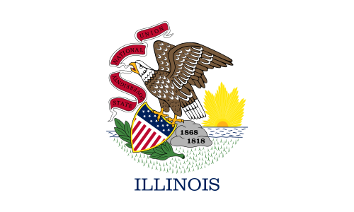
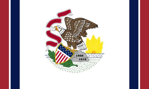
Illinois has gone through two official state flag designs, both of which are extremely similar to one another, being a depiction of the Illinois state seal on a white background. It joins a majority of state flags which simply depict their state seals on a flat color background, with “ILLINOIS” written underneath it to add clarity. There are a few symbolic elements in the design, such as the eagle representing liberty through strength and peace and the sun and river being a nod to the Illinois River; however, the flag is ultimately far too busy to be easily recognizable and ends up looking monotonous to many of the other state flags that have nearly identical elements.
Clearly, this redesign is highly warranted–but as X-Ray’s acting graphics editor and 18-year resident of Illinois, the contenders we have are appallingly underwhelming. When reviewing these flags, I developed criteria for a good flag design: it must be simple and recognizable from a distance, and it must have meaningful symbolism that isn’t too on the nose. Most importantly, it should spark a sense of state pride just through its appearance. I found that none of the following designs truly fulfilled any of these entirely.
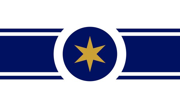
While this design is simple and doesn’t obnoxiously scream “ILLINOIS” like some of the other designs, perhaps it doesn’t scream it enough, as it seems like it could be the flag of any state with the symbolisms being so uninspired. The description provided seems like the design was created first, and then the connections were made up afterward, with vague references to the star representing “the standout features of our state” and the gold representing “the richness in our state, people, land and views”–statements that truly could be attributed to any state and be believable. My favorite stretch of a point is the notion that the central circle “abstractly represents the view from above Abraham Lincoln’s hat”–a laughable description of what is just a circle.
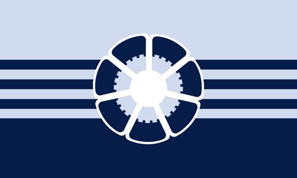
The elements behind this design are fairly creative: four lines representing Lake Michigan, the Mississippi River, the Ohio River and the Chicago River, and the central graphic made up of corn kernels and a 21-pronged gear as a nod to Illinois’ agricultural and industrial foundations making up the shape of our state flower, the violet. However, I feel like I don’t look at this flag and feel a sense of state pride; frankly, I look at this flag and I think, ‘Detroit.’ The design itself also isn’t the most visually appealing, with the white blending into the light blue background and making the central graphic not immediately visible. Overall, the thought is nice, but the execution could’ve been better.
Supposedly, there’s symbolism behind the different stripes in this design, but the controversy behind being eerily similar to the North Korean flag is enough to steer away from it.
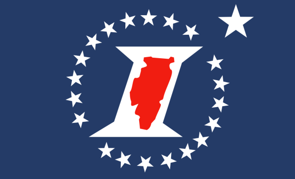
While there are elements of both of these flags that play a nice tribute to elements of Illinois (such as the Chicago flag star on the first design and the 21 stripes/stars on both designs representing Illinois being the 21st state in the union), the glaring issue I have with these designs is the ‘I’. When thinking about how to symbolize Illinois, putting a massive capital ‘I’ in the middle of the flag seems like a design choice for a college or university–not for a potential state flag. The latter design–the Sesquicentennial Flag created for Illinois’ 150th anniversary–adds even more to being too obnoxiously on the nose with the Illinois state silhouette. A flag should have meaningful symbolism, not just putting the state’s silhouette or initial in the center.

The orange and blue color scheme is nice, but I feel as though the butterfly in the middle is a bit too whimsical for a state flag design. It looks a little too much like it was made with Canva clipart, and though the butterfly is supposed to represent our state butterfly, the Monarch, I’ve never heard of Illinois being known for its butterflies before. The alignment of the 21 stars is more appealing than others on the list, but it still seems too cutesy to be appealing to the general public for a state flag design.

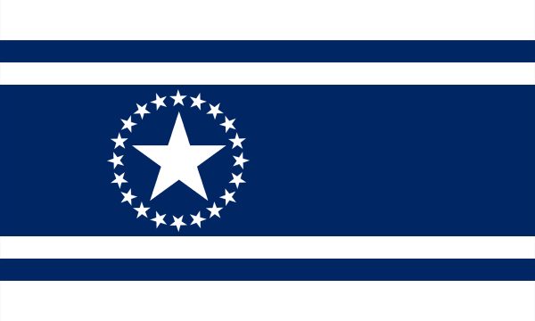
The other commemorative flag being presented as an option for the state flag redesign is the Centennial Flag, created to celebrate Illinois’ 100th anniversary. The only symbolism mentioned comes from the 21 stars which are placed in such a way that leaves an unbalanced empty space that seems unnecessary. It’s simple, but in this case, it seems too simple to the point where there’s nearly no meaning behind it.
Possibly the most unnecessary design choice of them all: the original flag with four additional lines which supposedly “eliminates the ‘seal-on-bedsheet’ look.” This design is meant to be strictly practical and not creative, which is very clear in its presentation. It aims to minimize costs on an entirely new flag design, but if the point was to save money, then I feel as though we wouldn’t be going to such lengths to choose a new state flag design. For being one of the top ten finalists of nearly five thousand entries, it’s disappointing that such a minimal addition made the cut, potentially taking a spot that could have gone to a more meaningful entry.
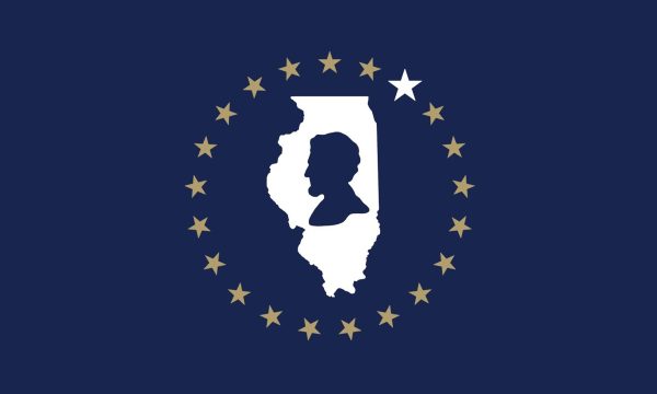
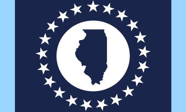
When I think of a design that is far too on the nose in its symbolism, these are exactly what I think of. Not only is the use of the state silhouette a completely unoriginal central point, but the plain silhouette of Lincoln in the middle of the first design makes you wonder why we aren’t just naming our state “Lincoln” if he’s going to be the focal point of our state flag. To make up for the lack of creativity in the design elements used, the commentaries add meaning to the symbols and colors that just fall flat, such as saying the state outline “symbolizes the pride we share for our state” in the first design or that the circular design symbolizes “Illinois being a kind of center of the country” in the latter design. These designs throw subtlety and symbolism out the door, and it results in a boring and uninspired design overall.
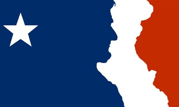
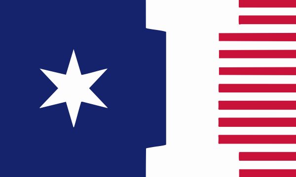
This flag takes its own spin on the genre of state flags that are simply “The U.S. flag, but a little bit different.” The design on this flag is “a nod to the French flag” without an explanation for exactly why, with the red area being Illinois’ border to the Mississippi River and the blue area being a silhouette of Abraham Lincoln. I do think this takes a creative twist on two elements that are often overdone in our state designs: the state silhouette and the overuse of Lincoln, even though he was born in Kentucky. This flag includes these elements without them being too overbearing and acts as a nice nod to these two symbols, though its reference to the French flag seems confusingly out of place.
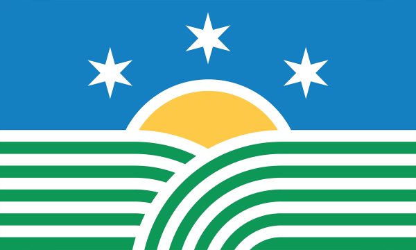
I greatly appreciate this design’s commitment to a different composition that is fairly appealing. I also admire how I think of Illinois when I see this flag without it being so overt, especially with the curved lines forming Illinois’ famous plains and creatively incorporating 21 stripes. The background behind this flag comes from a person who does seem very passionate about this state and its small-town side, a notion that can’t be said for some of the other designs which feel more sterile and don’t come with such a sense of pride. However, it’s the colors that I think make this flag immediately seem tacky, with an artificial brightness feeling a bit cartoonish and childish. If the design was a bit more polished to be more professional, I do think it could gain a lot more popularity amongst voters.
With those being all the candidates, there’s not one that truly stands out as being the clear winner. Personally, those I’ve talked about this topic with have been equally shocked that these designs are the best we have. Regardless, voting for the new state flag designs will continue until Feb. 14, 2025, after which the results will be shown to the General Assembly to aid them in their decision as to what the final state flag design will be. Votes can be cast every 24 hours on the Illinois Flag Commission website, so cast your vote to have your voice be heard.
All images were taken from the Illinois Flag Commission website.